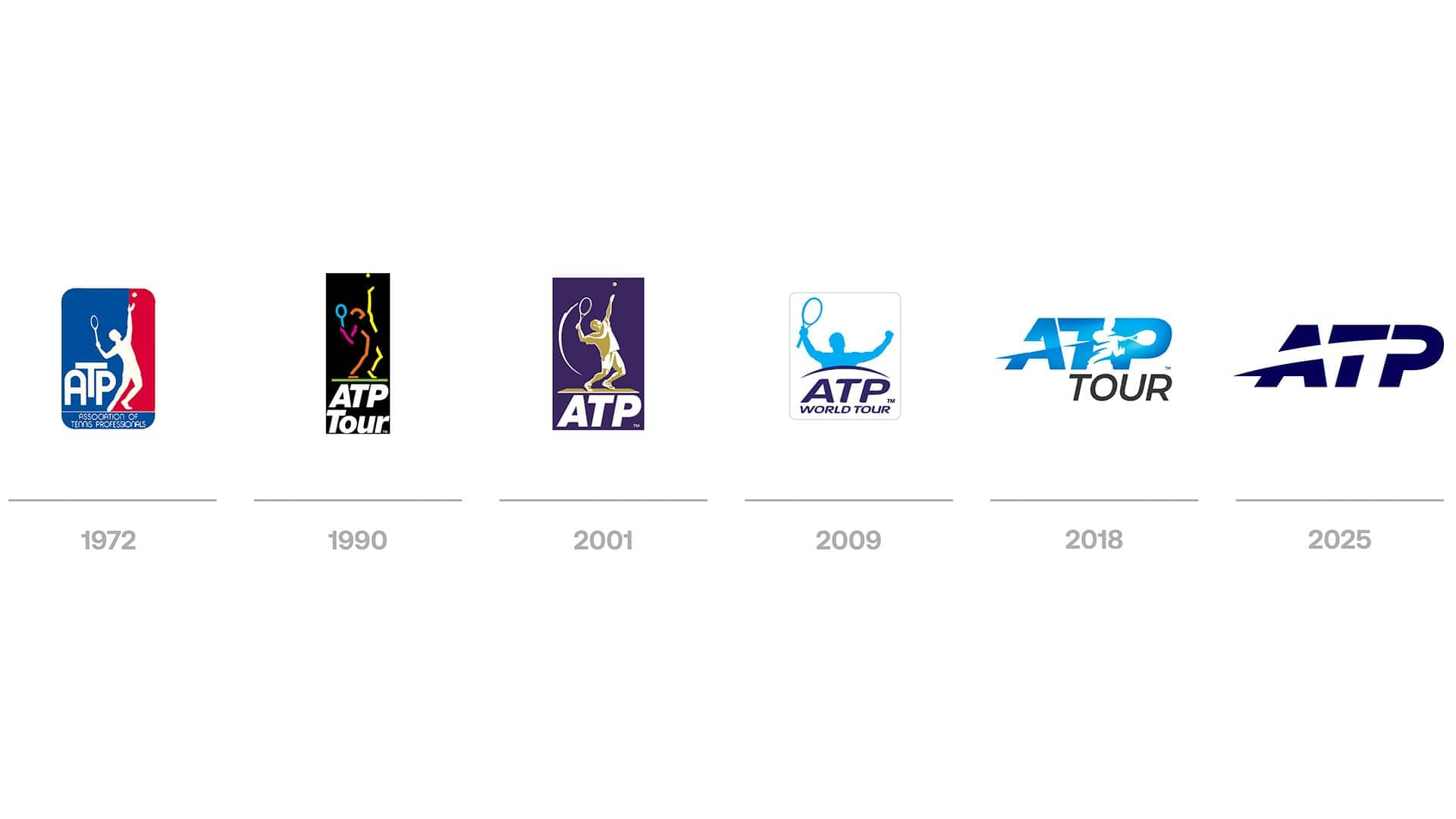
ATP Introduces Revamped Logo and Brand Identity for 2026 Season
The refreshed logo is tailored for the digital era, ensuring optimal versatility across various platforms and products.
Date: November 5, 2025

ATP Tour Highlights
By Press Announcement
LONDON – The ATP has unveiled its latest logo evolution, marking the sixth redesign in its 54-year legacy. This modernized design honors ATP’s rich history while enhancing its visual identity for the contemporary audience.
Crafted for the digital landscape, the new logo increases adaptability across broadcasting, social media, merchandise, and event branding. Its dynamic design mirrors the exhilarating motion of a tennis ball in action.
“Tennis is continuously evolving,” remarked Eno Polo, ATP CEO. “To resonate with our global audience, we must convey our narrative with creativity and dynamism. Our new brand identity encapsulates the thrill, precision, and rhythm of the Tour, appealing to current fans while reaching out to new generations discovering tennis.”

This logo transformation is part of a broader brand overhaul scheduled to be deployed across all ATP platforms in 2026. Partnered with the esteemed design agency Chermayeff & Geismar & Haviv, the new branding streamlines ATP’s visual communication, fostering a more unified and modern aesthetic for the sport.
The brand refresh aligns with ATP’s long-term vision to connect with younger demographics and deepen fan engagement. In the past year, ATP has established collaborations with TikTok and Overtime and launched the global marketing initiative ‘It All Adds Up’, created by Wieden+Kennedy.
These efforts underscore ATP’s dedication to enhancing the tennis experience, making it faster, more digital, and richer in expressiveness than ever before.


